The part of visual decision-making nobody taught you - for coaches, course creators, and digital product sellers...
The story most people tell themselves
When someone tells me their page's visuals look off, the first thing I ask is: what do you think the problem is?
The answer is almost always the same.
"I just don't have an eye for design." Or: "I'm not a visual person." Or the classic: "Some people are born with it and I'm not."
And yes, some people genuinely don’t and some people truly have a natural instinct for visuals.
They can look at something and immediately feel what is wrong, or know intuitively what it needs. That sensitivity is real. Not everyone has it. And pretending otherwise is not helpful at all.
But
Not having that instinct does not mean you can not build visuals that work. And having it does not mean you will. Funny how that works, eh?
And if your pages are not converting the way they should, this is not a neutral problem.It is not just “aesthetic.” It is slowly costing you every single day you leave it as is.
Also if the instinct kinda tells you when something feels off: It does not automatically tell you what to do about it, especially inside a funnel or a page where the visual has a job to do beyond just looking ‘pretty’.
So whether you have the eye or not, the same thing is missing for most people: the actual decisions that determine whether a visual works. Nobody really teaches those directly. They are just assumed to be either talent you have or talent you do not.
They are not. They are learnable. And that is what this is about. If your pages feel off but you cannot explain why well..this is why and what to do about it.
Cheap looks cheap
Let me say something design people like to dance around:
Some visuals are just bad. Not misaligned. Not “not your style.” Just functionally bad. And they undermine everything you are trying to sell.
A pixelated logo. A font that looks like it came from a 2009 birthday invitation. Four clashing colors because you could not decide between them. Text crammed into corners with no breathing room. A layout that looks like the elements were placed randomly and nobody checked.
BUT
The truth is kind of something else and more honest:
Cheap-looking visuals create doubt and that is where most people lose the sale without even realizing it. Not a specific conclusion about the creator’s professionalism or work ethic - tho it can too - but just a general, often subconscious assumption that makes the person on the receiving end slightly less certain about what they are looking at or want to buy.
Generally people do not think "oh, this person doesn't take their work seriously." (except maybe designers lol)
You - hopefully - care enormously about your work.
You - hopefully - be exceptional at what you do.
But, your chosen visuals just are not communicating that and people have no other signal but those visuals & style to go on, so it can cost you trust at the exact moment you need to build the trust most.
However
The visual does not need to be super-duper beautiful to avoid this rather it needs to be intentional. There is a meaningful difference between simple-and-considered and simple-and-unfinished. People feel that difference immediately.
And in a funnel or on any page, that feeling is expensive. Because people do not stop and analyze why something feels off. They just leave.
And you never get to explain what you actually do.
Also,
This is not about spending money on a designer for every piece of thing you create. It is about understanding that your visuals are a signal. Always.
Whether you intend them to be or not!!!!!
The good news is that most of the things that make something look cheap are fixable without being born with talent. They are partially fixable with some extra knowledge.
Why people end up with ugly anyway - even with every tool available
This is the part that confuses people and confuses me too sometimes.
The tools these days are better than they have ever been. Canva has thousands of templates. AI can generate images in seconds.
And yet people still end up with something that looks wrong - meh - & that is hard to unsee once you notice it.
- A font that was probably beautiful on the template preview and is completely illegible at body copy size on a mobile screen.
- A color combination that somehow survived every stage of the build without anyone stopping to ask whether it was readable.
- A layout where the most important thing on the page - the offer, the headline, the reason someone is there - is visually indistinguishable from everything around it.
- The tools did not cause this. The absence of criteria did. When you do not know what you are optimizing for, you optimize for whatever feels good in the moment. And felt-good-in-the-moment is a terrible design brief. This is the part nobody teaches anyone who is trying to DIY…..And it is exactly why the problem does not go away.
And every time you build like that, you are stacking small decisions that pull people away instead of pulling them in.
> You see the result of lower conversion.
> You just don’t connect it to the visual decisions that created it.
So the question worth asking is not "why do my visuals look off" rather it is why, with more tools and more options than ever before, the problem has not gotten better.
Because tools give you access to options. They do not give you the judgment to choose between what is available.
Opening Canva and seeing five hundred templates does not help you if you do not know which one is right for what you are making.
- Having access to every Google Font does not help you if you can't tell the difference between a font that is readable at body size and one that only looks good in a large preview, or why two fonts that both seem fine individually can look completely wrong next to each other.
- A color palette generator that gives you ten combinations does not help you if you cannot tell which one will still look intentional once it is spread across an entire page and which one is going to turn into a mess the moment you add a background, a button, and a block of text. Heck even simpler: what colors and shades should be used where and at what ratio.
And this is not a dig at designers - it is about what they are usually hired to do. The brief is almost always "make this look good." Rarely "make this work inside this specific funnel, for this specific offer, at this specific moment in the buyer's journey." Those are different jobs. And the second one is the one that actually determines whether the page performs or not.
More templates, more fonts, more color tools - none of that is the problem. The problem is that most people have no way of translating what they want to communicate into actual visual decisions.
They know their offer. They know their audience. They just can’t connect that knowledge to a color, a layout, a font choice, because nobody ever showed them how those things are connected.
If you want a fast reality check, look at your page or digital assets and ask:
- Can I tell what this is in three seconds?
- Is the most important thing actually the most visible thing?
- Do the visuals support the offer or just decorate it?
If the answer is unclear on any of those, the problem is not the tool.
And leaving it “unclear” is not harmless. Unclear pages do not get second chances.They get skipped.
The three-way fit most people don’t even know about - and how to get there
Here is the mediocre version of design advice most people have heard:
Know your audience. Design for them. Match your visuals to what they respond to and you are set.
Solid advice but it is one third of the whole picture.
Every visual that works has one thing in common. It fits: The seller -you- the offer, the audience and all three are present in it somehow. And when they are, the page & offer feels like it could only have come from one person, for one specific thing, aimed at one specific kind of human. You cannot peel it off and paste it somewhere else and have it work just as well.
Which, if you spend any time in the online business space, you will know is rarer than it should be. Most pages and offers look like they were built by someone who studied what was already working and reproduced it carefully. Which is a fine strategy to a certain extent - don’t get me wrong - for a lot of things. For visuals it just produces a slightly blurrier version of something the market has already seen therefore it gets lost in the noise.
So how do you actually get there?
This is not how I work now - used to but with time the whole thing is just coming naturally - but go further and read how I currently do it:). But it is useful for when you have nothing to go on yet or when the feeling is there but the taste is not calibrated enough to translate it into actual decisions. Which is most people, most of the time. Not a criticism. Just a starting point.
Also,
When the offer is new, when you are too close to it, when you sit down and the feeling just is not there. These questions are not a design process. They are a way of extracting something to start from - so you are not just opening Canva and hoping something pops at you from the sidebar’s template gazillions.
From yourself:
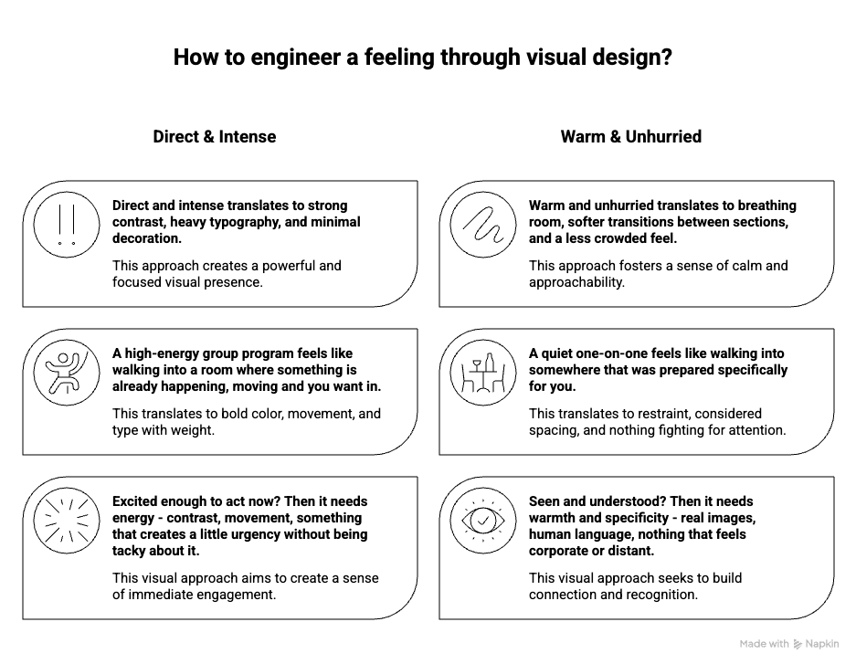
Ask: how do I actually show up? Not your brand persona. Not your aspirational aesthetic. The real thing. Are you direct and a little intense? Are you warm and unhurried? Are you chaotic and fun in a way that people find weirdly trustworthy?
Now translate it. Direct and intense probably means strong contrast, heavy typography, not much decoration. Warm and unhurried means breathing room, softer transitions between sections, nothing that feels rushed or crowded. Chaotic and fun means you can break rules - asymmetry, unexpected color, something that feels slightly alive.
The visual equivalent of your personality is not a vibe. It is specific decisions about weight, space, and contrast.
From the offer:
Ask: if this offer was a place, what would it feel like to walk into it? And is that the feeling my buyer needs to have before they can say yes?
If those two answers match - your visual direction is already there. You just have to express it.
> A high-energy group program feels like walking into a room where something is already happening, moving and you want in. That is bold color, movement, type that has some weight to it.
> A quiet one-on-one feels like walking into somewhere that was prepared specifically for you.That is restraint, considered spacing, nothing fighting for attention. A course that teaches something practical and no-nonsense feels like a well-organised workshop - clear, functional, no unnecessary decoration.
> A trauma-informed coaching program and a no-nonsense business accelerator can both be high-ticket. They are not the same offer. They should not look the same. One needs visual language that feels considered, safe, human. The other might thrive with something almost aggressive in its confidence. Neither is more legitimate. Both are right for what they are. The visual has to match the nature of what is being sold not just the price tag.
The feeling of being inside the offer is your visual direction. Not the features. Not the outcome. The feeling of living in the offer itself. (wild thing… I know)
That emotion maps directly to visual choices. Safe maps to clean and consider. Excited maps to bold and high contrast. Seen maps to warm and specific.
You are not just decorating a page. You are engineering a feeling. The decoration is just what that looks like when it is done right.
From the audience:
Ask: what does my audience actually look like - not demographically, visually. What are they drawn to? What is already in their world? And what do they need to feel - not think, feel - to take the next step?
Safe enough to trust you with their money? Then your visual needs to remove friction - clean layout, consistent choices, nothing that creates doubt.
Excited enough to act now? Then it needs energy - contrast, movement, something that creates a little urgency without being tacky about it.
Seen and understood? Then it needs warmth and specificity - real images, human language, nothing that feels corporate or distant.
A 40-year-old female executive and a 24-year-old creative freelancer can both need the same transformation. They do not share the same visual language. One responds to something refined and understated. The other might respond to something rawer and more immediate. If your visual does not feel like it belongs in their world - if it looks like it was made for someone else - they will feel like the offer is not for them before they read a single word.
And here is where most diy-ers make the mistake that frustrates the heck out of the visuals entirely: designing for multiple audiences. Softening the edges so it is not too bold. Adding warmth so it is not too cold. Pulling back on anything too specific so it does not alienate anyone.
The result is a visual that belongs to nobody. Inoffensive enough that nobody rejects it. Bland enough that nobody feels seen by it either. And when nobody feels like it is for them, nobody buys.
Pick your person. Design for them fully. Trust that the right people will recognise themselves in it immediately and that the ones who do not were never yours anyway. That is not a loss. That is the filter doing its job. Specificity is not a risk. It is the point.
Ps: Designing for multiple audience types is a skill. It means creating genuinely distinct visual expressions - not compromising one into the other. Until you are there, just stick to one type of audience. The visual that clearly belongs to one specific kind of human attracts that human with a pull that a watered-down version never will.
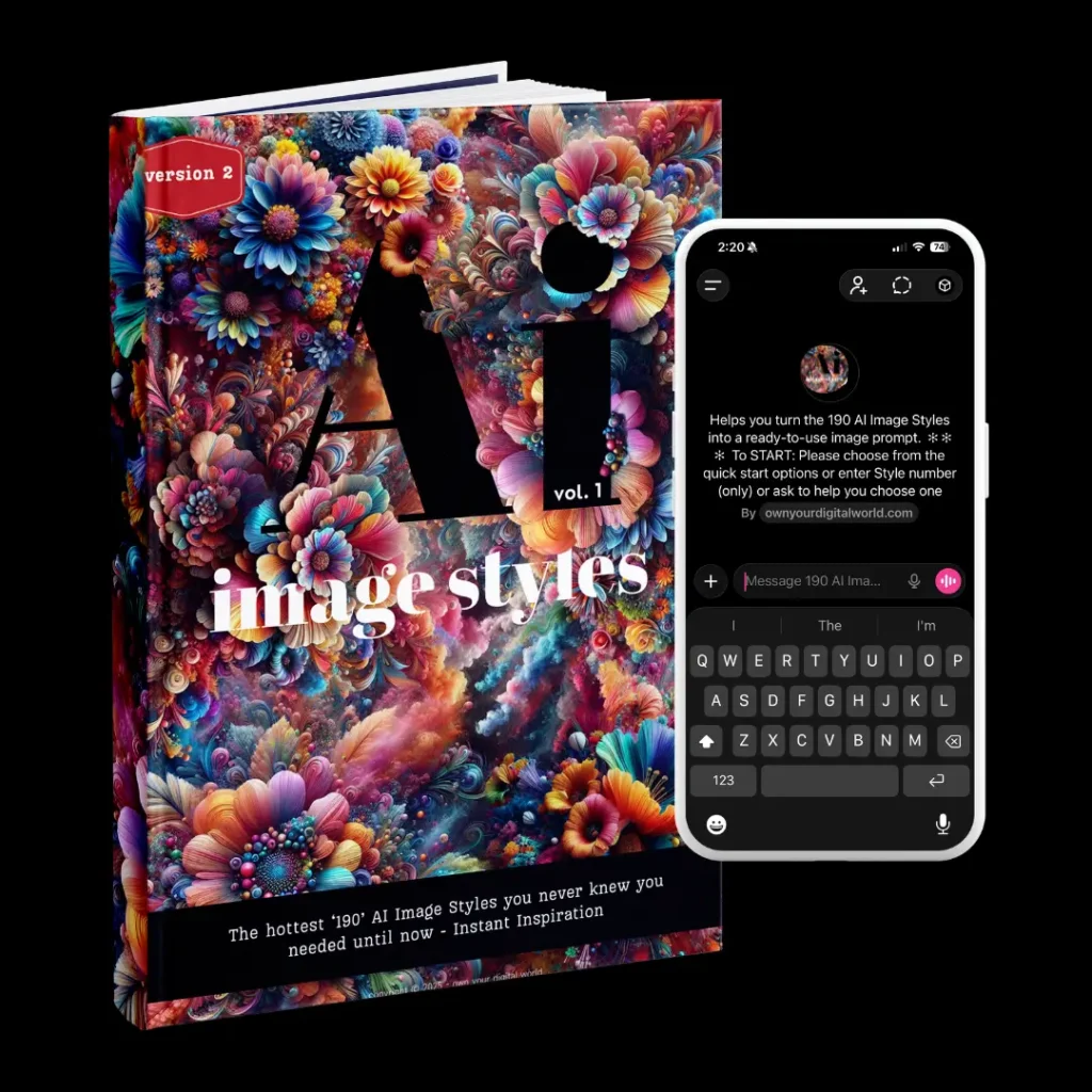
Ok so are you ready to know how I do make it visually fine - after many years?
The way I actually do it - and the way a lot of people with strong visual instincts do it without realising - is almost the opposite.
It starts with a feeling. (contradicting - I know - especially after what I just told you - but did you read the part right?)
Specifically, how I feel about the offer. What energy it carries. What I want someone to feel the moment they land on it. And usually it starts with a single image. One photo, one texture, one reference that catches something I cannot fully explain yet. Everything else builds from there - the palette, the mood, the typography, the whole visual direction. All of it living inside one image that just felt right at midnight and would not leave me alone.
That is not a methodology. It is not something I can hand you as a system. But it produces work that feels coherent in a way that starting from a brand guide rarely does, because everything is pulling from the same original feeling rather than trying to match a set of rules.
The honest version of this advice is simple: there is no correct starting place. Some people start with the audience. Some with the offer. Some with a color or a reference image or a feeling they want to create. All of it can work if you have intentions and know that.
What can’t work is starting from nowhere in particular, opening Canva, picking a template that looks nice, and hoping it adds up to something that fits. That is not a process that will create the results you are aiming for.
What you need to truly understand:
When all three are aligned - when the visual feels like an honest expression of you, accurately represents what the offer is, and lands right for the people it is for - something happens beyond looking good. The page feels true. And things that feel true get trusted in a way that designed-to-impress never quite achieves.
Ps: Yes, I do fck it up sometimes too. - so give yourself a break when you feel that no matter what you try it is just NOT IT.
Now let’s touch on some controversial stuff - this should be fun…lol
On boldness, premium, and the advice you should stop believing
Many designers will tell you: bold and punchy equals low-ticket. Clean and minimal equals premium. Match the visual to the price point.
It is passed around constantly. It is mostly wrong.
Supreme is loud, blunt, and sells $60 hoodies with a cult following. Balenciaga does ugly-on-purpose and charges four figures. Some of the highest-converting offers in the online business space are built on dark backgrounds, heavy typography, and zero softness. None of them got the memo about premium needing to feel calm.
Boldness is not a price signal. It is an energy signal. And energy can absolutely be premium - when it is honest, when it fits the seller, when it fits the offer.
The real question is never "does this look expensive?"
It is: does this feel true?
A $3,000 coaching program built by someone who is intense, direct, and transformation-focused might be perfectly served by something visually aggressive. A $97 course built by someone thoughtful and gentle might need something quiet and considered. Neither formula applies universally. Context is everything.
What does apply universally is this: when the visual does not match the reality of what it is representing, people can totally tell and just leave.
On brand cohesion and why the conventional thinking is a creativity ceiling
There is a version of brand consistency advice that goes: pick your colors, your fonts, your style, and stick to it. Every touchpoint should match. Everything should be instantly recognizable.
Safe advice and true BUT. Also, in most cases, creatively dead aka boring.
A single brand can have visually distinct expressions across different offers - different energy levels, different design treatments, different visual registers entirely - and still feel completely coherent. Not because every pixel matches, but because there is something underneath the surface that runs through all of it. A recurring pattern. A signature graphic style. The way type is set. A particular use of negative space. The emotional tone that photographs are chosen for.
That thread does not have to be visible to be felt. And when it is felt without being seen, that is when brand identity moves from recognizable to magnetic.
The brands that live inside a rigid style guide produce things that are consistent and forgettable in equal measure. The brands that understand their through-line can break the surface rules as much as they want, because the thing that makes them feel coherent is not the color matching. It is something deeper.
At this point, most people try to fix this by tweaking pieces.
Maybe: A better font. A nicer color. A different image.
That sometimes works... and sometimes it doesn't.
Because the issue is not the pieces.
It is how they were chosen in the first place.
What I actually see when I look at a page
There is a specific experience that happens when you look at a lot of pages professionally. You stop seeing them the way a regular person does: sequentially, reading left to right and start seeing them all at once. The whole thing lands in one impression before a single word registers.
And the first impression is almost always one of two things: this works, or this does not.
Not good or bad.
Not professional or amateur.
Just: this is doing its job, or this is getting in the way of its job.
Here is what actually creates that impression >>
The overall visual before anything else
The ugliness, if it is there, lands first. Before the headline. Before the offer. Before any of the individual decisions that went into the page. Just a whole-page feeling of something being off.
Most people think ugly is about individual bad choices. A bad font. A bad color. It is rarely that simple. Ugly is usually what happens when nothing on the page was chosen in relation to anything else. Every element made sense to someone at some point, but nothing was considered as a whole. The result is a page that looks like it was built in parts by people who never spoke to each other.
The fix is not finding better individual pieces. It is stepping back and looking at the whole thing before you look at any of it.
The imagery
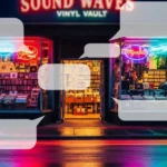
This is where pages lose people before they even start reading. And it is the thing I see go wrong most consistently across sales pages, websites, PDFs, workbooks, lead magnets, all of it.
The wrong image does not just look bad. It actively contradicts everything the copy is trying to do. You can write the most compelling offer in the world and a stock photo of a woman laughing at a salad will quietly dismantle the whole thing.
What I look for: does the imagery feel like it came from the same world as the offer? Does it look like someone chose it or like someone needed an image and this was available? Is it sharp, or is it slightly soft in a way that makes the whole page feel slightly soft? Does it show something real - you, your work, the inside of what you are selling - or is it decoration pretending to be content?
For digital products and workbooks specifically: show the thing. A well-designed PDF spread, a clean mockup of the workbook, a screenshot of the dashboard. The image of the thing you are selling is doing sales work. A generic lifestyle image is just taking up space.
The fonts
Not whether they are beautiful. Whether they are doing their job.
The thing that actually kills pages typographically is not a bad font choice in isolation — it is fonts that were never made to work together being forced into a relationship they cannot sustain. Two fonts that both seem fine individually but create a low-level visual tension the reader cannot name and cannot ignore.
The other thing I see constantly: decorative fonts at sizes and in contexts where they have no business being. A beautiful script that made sense as a headline accent showing up as a subheadline, then a pull quote, then a button label until the whole page has a handwriting problem.
The font is not ugly when you are looking at it….. It is just wrong for the job it was chosen to do..
The colors
Last in the order of what hits me and not because they matter least but because color problems are almost always a symptom of a decision problem.
The pages where color goes wrong are not usually pages where someone chose bad colors. They are pages where someone chose colors at different times for different reasons and never looked at them together. A background from a template they liked six months ago. A button color from a brand kit. An accent pulled from a stock image. None of it intentional as a system.
The result is a palette that looks like it accumulated rather than being chosen. And accumulated palettes have a specific quality - they look busy even when the layout is clean. Because the eye is doing extra work trying to find the logic in the color relationships and finding none.
For workbooks and PDFs specifically: color consistency across pages is the thing that makes a designed asset feel premium or feel like a Canva template someone finished in an afternoon. Not which colors. How consistently and intentionally they are used across every page of the thing.
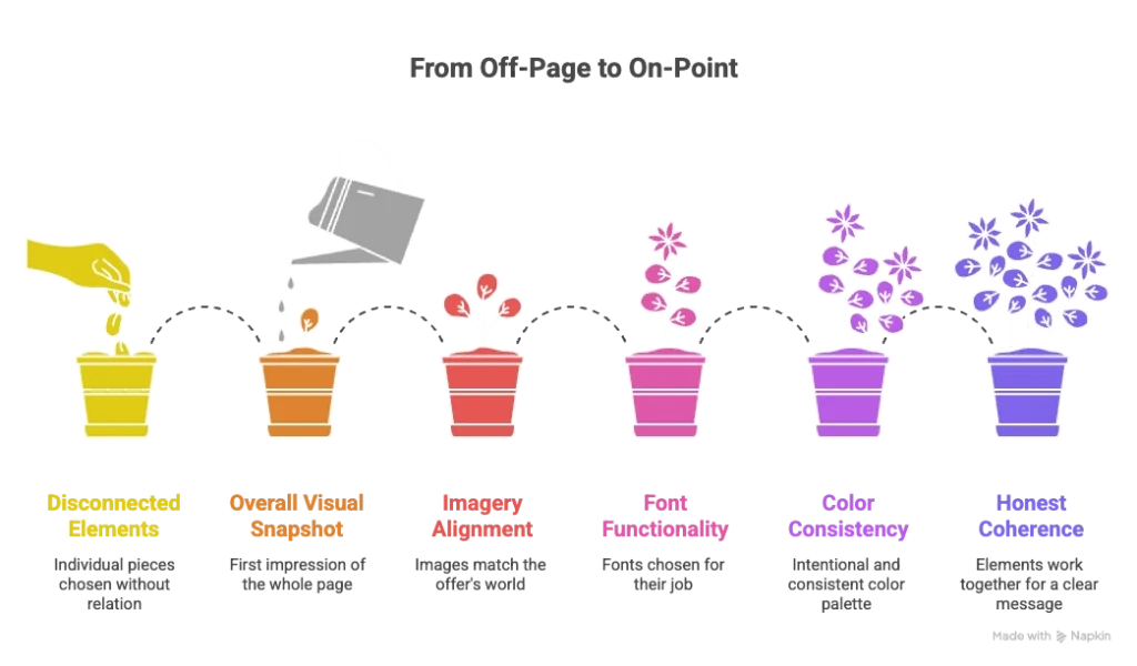
The thing underneath all of it
When a page looks off, the individual elements are rarely the actual problem. The actual problem is that nobody looked at the whole thing and asked whether it was honest. Honest to the offer, honest to the person selling it, honest to the person it is for.
When it is honest it holds together even if the individual choices are not perfect, even if the font is not ideal, even if the images could be better. There is a coherence to it that the eye recognises before the brain can explain why.
When it is not honest? When it is assembled from borrowed pieces that were never really connected then no amount of fixing individual elements will make it work. Because the problem is not the elements. It is the absence of a through-line.
That is the thing I am actually looking for. Everything else is just where I start looking for it.
So what now?
You have read this far which means one of two things.
Either you are looking at your pages differently than you were twenty minutes ago and noticing things you cannot unnotice now, which is both useful and slightly annoying. Or you already knew something was off and you just needed someone to name it.
Either way, you are now standing in front of the same choice everyone stands in front of at this point.
You can close this, go back to what you were doing, and keep wondering why the pages are not performing the way the offer deserves. That is a valid choice. Most people make it.
Or you can actually do something about it.
Not perfectly. Not all at once. But something - one page, one asset, one decision made with actual intention behind it instead of just whatever felt fine at the time.
Because here is the thing that this whole post has been building toward: the gap between visuals that work and visuals that do not is not talent. It is not budget. It is not having the right tools.
It is whether someone made real decisions - about the seller (you), the offer, the audience, the feeling, the hierarchy, the honesty of the whole thing - or whether they just filled the space and hoped for the best.
You now know the difference.
Not between “pretty” and “not pretty.”
Between decisions and guesswork.
The next move is yours.
Because at some point, it stops being about learning more and starts being about fixing what is already not working.
And if you are tired of guessing and want your pages to actually work - not just look decent - that is what I do. - that is what I am here for. I build custom websites and funnel pages for coaches, course creators, and digital product sellers in WordPress and Divi. Not what looks good in a portfolio rather what fits the offer, the person behind it, and the people it is for - and performs accordingly.
If that sounds like what your pages need - let's talk →